Service Overview
Interface experience design sits at the intersection of user needs and business goals. Before any visual styling begins, we analyse how people arrive at your site, what they are trying to accomplish, and where current flows create confusion or unnecessary steps. This research-informed foundation ensures that design decisions serve real behaviour rather than assumptions.
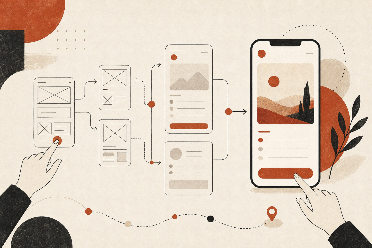
Our process produces wireframes that define content hierarchy, navigation patterns, and interactive states — giving stakeholders a clear picture of how the site will function before colour and typography enter the conversation. From there, high-fidelity interface designs refine typography, spacing, feedback mechanisms, and micro-interactions that make the experience feel polished and responsive.
The service can stand alone for teams that already have development resources, or integrate seamlessly with our corporate website, landing page, and front-end implementation offerings. The output is a documented, testable interface system that developers can build from with confidence.
Who This Is For
This service benefits any project where user flow and interaction quality directly impact outcomes — whether that means higher conversion rates, lower support volume, or improved satisfaction among returning visitors.
- Product teams building or redesigning a web application or customer portal
- Businesses with high bounce rates or confusing navigation patterns
- Organisations preparing for a redesign that want structure before aesthetics
- Startups needing investor-ready prototypes with realistic interaction flows
- Teams with in-house developers who need detailed UX specifications to build from
What's Included
Each UI/UX engagement covers the full spectrum from research through polished interface design. Deliverables are structured so your team can review, test, and implement at each stage without gaps in documentation.
Journey Mapping
Visual flow diagrams showing how key user segments move through your site from entry to goal completion.
Wireframe System
Low-fidelity layouts for all primary screens with annotated interaction notes and content placement.
UI Component Library
Buttons, forms, cards, modals, and navigation elements designed with consistent states and spacing rules.
Responsive Specifications
Breakpoint behaviour documented for each screen so layout shifts are intentional, not accidental.
Our Approach
We begin with stakeholder interviews and a review of existing analytics or user feedback to identify pain points. Personas and journey maps translate these findings into concrete scenarios — what does a first-time visitor need versus a returning client? Where do people abandon forms or get lost in navigation? These questions drive the wireframe phase.
Wireframes are shared early for collaborative review, allowing structural changes before visual investment. Once approved, we apply the interface layer — typography, colour, iconography, and motion — while maintaining the interaction logic established in the wireframes. Usability principles guide every decision: clear labels, visible focus states, logical tab order, and error messages that help rather than hinder.
- Discovery workshop covering user segments, tasks, and success metrics
- Annotated wireframes with interaction notes for each key screen
- Iterative review cycles with structured feedback collection
- High-fidelity UI designs with hover, active, and error states defined
- Developer handoff with spacing, type scale, and component documentation
Deliverables
- User journey maps for primary audience segments
- Low-fidelity wireframes for all scoped screens and flows
- High-fidelity UI designs with desktop and mobile variants
- Interactive prototype for key user flows (when included in scope)
- Component library with state variations and usage guidelines
- Spacing, typography, and colour specification document
- Annotated handoff files ready for development implementation