Service Overview
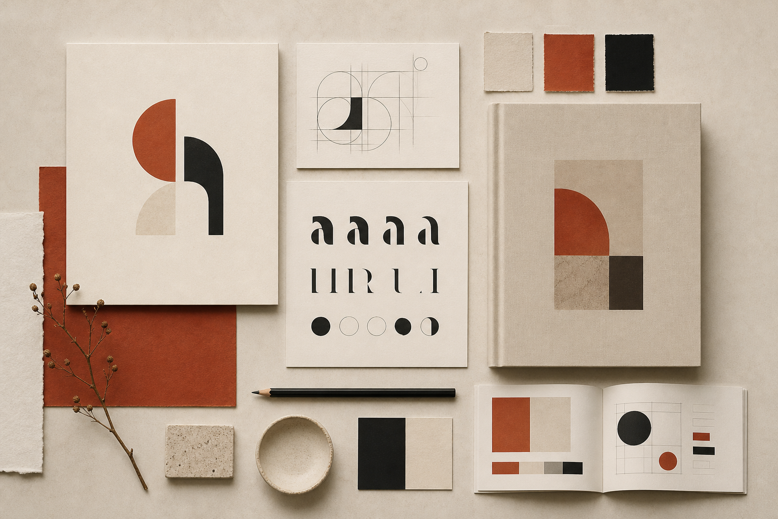
A visual brand system is more than a logo file. It is a documented set of rules and assets that ensures your brand looks intentional whether it appears on a homepage hero, an email header, or a presentation slide. We build these systems from the ground up for new brands, or refine and extend existing identities that have outgrown their original guidelines.
Our work covers the core elements every digital brand needs: logo variations and clear-space rules, a curated type pairing with hierarchy scales, a colour palette with accessible contrast ratios, and a library of supporting graphics, patterns, or icon styles. Each element is designed to work together and documented so your team — or any future agency — can apply them correctly without guesswork.
Brand systems integrate naturally with our website design services. When we handle both branding and web design, the visual language flows seamlessly from guidelines into live interfaces — no translation gaps between brand document and browser.
Who This Is For
This service is for businesses that need a cohesive visual identity before or alongside their digital presence — or for established brands whose current assets lack the structure to scale across new channels.
- New businesses launching their first professional brand identity
- Companies rebranding after a merger, pivot, or market repositioning
- Organisations with an existing logo but no formal usage guidelines
- Teams preparing for a website project that requires defined brand assets upfront
- Brands expanding into new regions or channels that need consistent visual rules
What's Included
Each brand system engagement produces the visual foundation and documentation your team needs to maintain consistency across every platform and collaborator.
Logo System
Primary and secondary logo marks, monochrome versions, favicon, and clear-space rules for every application context.
Typography Pairing
Heading and body type selections with size scales, weight usage, and line-height specifications for web and print.
Colour Architecture
Primary, secondary, and accent palettes with hex values, contrast ratios, and guidance on background pairings.
Digital Asset Kit
Social media templates, presentation backgrounds, icon style samples, and pattern or texture elements for web use.
Our Approach
Brand development starts with understanding your positioning, audience, and competitive landscape. We explore mood directions through curated reference boards before committing to specific visual routes. Logo concepts are presented in context — on mock business cards, website headers, and social profiles — so you can evaluate how the identity performs in real applications, not just on a white canvas.
Once a direction is approved, we expand it into a full system. Every colour, type size, and spacing rule is tested for accessibility and cross-platform compatibility. The final brand guidelines document serves as a practical reference, not a decorative portfolio piece — your team should be able to pick it up and apply the rules immediately.
- Brand discovery covering values, audience, and competitive positioning
- Mood board presentation with two to three visual direction options
- Logo refinement with contextual mockups across key touchpoints
- Full system build-out including type, colour, and supporting elements
- Brand guidelines document with usage rules and asset export package
Deliverables
- Primary and secondary logo files in SVG, PNG, and PDF formats
- Favicon and social media profile/cover image templates
- Typography specification with web font links and fallback stacks
- Colour palette document with hex, RGB, and accessibility notes
- Brand guidelines PDF covering logo usage, type, colour, and tone
- Digital asset folder with templates and supporting graphic elements
- Web-ready brand tokens for integration into site design or development