
01
Our Craft
Precision in Every Detail
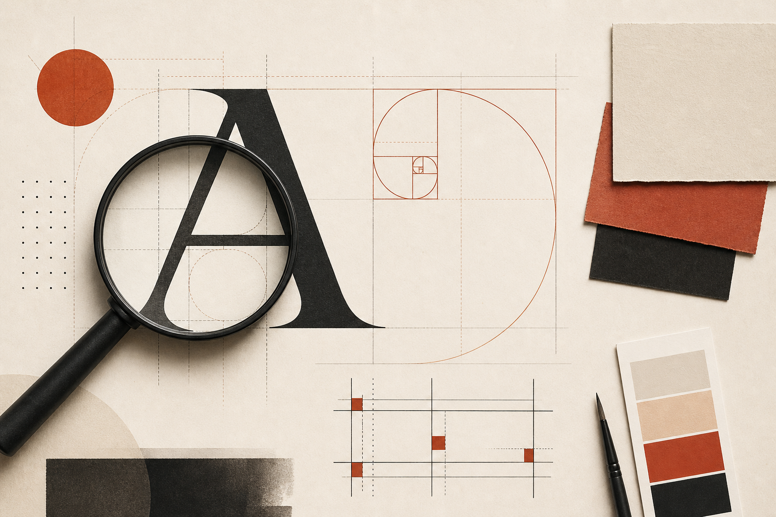
We treat design as a discipline of decisions — not a collection of trends. Type scales are calibrated for readability. Colour is applied with restraint. Spacing follows a consistent rhythm so pages feel coherent whether viewed on a wide monitor or a phone held in one hand.
- Typographic systems built for legibility
- Visual hierarchy rooted in content priority
- Interfaces tested for real-world usage patterns